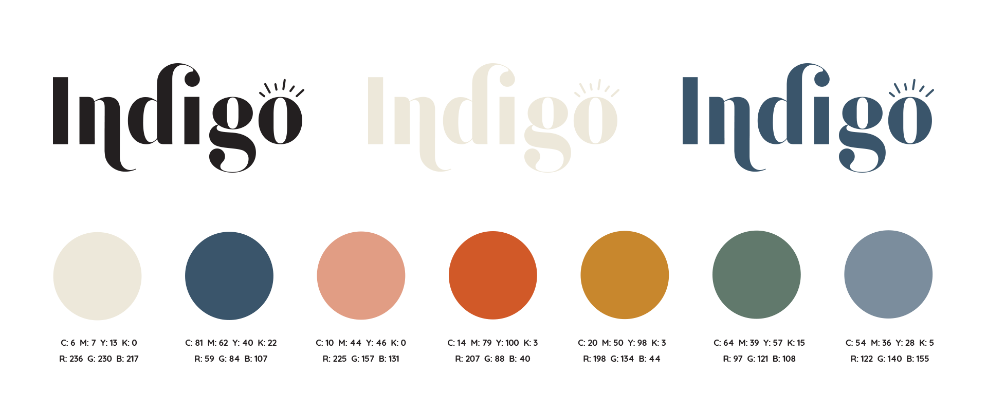
How We Reinvented Indigo’s Brand Logo
On a daily basis, we as consumers are inundated with brand logos. In a split second a company or individual’s branding must convey so much, silently, for us to decide whether we engage or move on. We’re a fickle bunch, and we have increasingly short attention spans. With that in mind, brand identity has to be sharp, clever, eye catching and most importantly, align with the business it’s representing. No pressure, of course.
When Indigo, a modern, progressive wellness-focused salon in Silicon Valley, CA came to Brandettes to reinvent their brand logo, we were honored. Indigo, led by owner and award-winning educator Dana Taylor, was in the process of re-imagining their guest experience and needed a brand identity that matched their new vision. We thought it would be interesting to share how we worked with Indigo to achieve their goals, to go behind-the-scenes with us as we worked alongside the client to extract what truly matters to them, to define their taste and produce a brand logo and accompanying identity package that they (and their guests) truly love.
Here is the original logo below…
Defining Indigo’s Brand Goals
At Brandettes, most all of our new client work starts with a brand questionnaire. It’s nothing too crazy, just a short series of questions that can be answered in 20 minutes or less. The questionnaire helps us define success and target our audience effectively. Ultimately, our brand logo and brand identity work must resonate with the target audience, period. Yes, the logo can be attractive, internally we could think it’s really cool, even the client might enjoy it. But if it doesn’t hit home and attract the target audience, something has gone astray.
Indigo’s goal was to inspire confidence and creativity by recognizing and enhancing one’s natural beauty. With a focus on client wellness, we wanted to make sure we created the right logo, color palette and iconography to effectively communicate to new and existing guests what Indigo delivers. It was helpful for us to know at the beginning of the project where the brand logo would be used. All of the standard uses applied- website, business cards, salon signage and logowear. However, Indigo is uniquely active on social media. Dana regularly posts finished looks, inspiration and engages Indigo’s audience through Instagram. Knowing she needed icons for Instagram Stories, Highlights and posts upfront was extremely helpful to our process.
Understanding What Indigo Is and Isn’t
Next, we worked with the client to put a short list of adjectives together that defined what their business is and, equally important, what it is not. Understanding the ethos of what the brand logo needs to communicate is essential and breaking it down into single words makes things easy for us and for our client. In Indigo’s case, they shared words like “authentic”, “timeless”, “welcoming” and “understated” to describe the brand. Warmth and hospitality are everything to Dana, so Indigo’s brand logo must share this as a priority.
On the flipside, we learned Indigo was not “trendy”, “inaccessible” or “too polished”. There are no hard lines with this brand and its inclusive nature is important to Dana as a leader.
Upholding the Brand Pillars
In this next phase, we sought to understand a few key brand pillars that would serve to, once again, frame the brand. A quick way to define pillars is to finish the sentence, “Everything I do is based on…”. This should reinforce the information gathered through the brand goal and the brand is/isn’t exercise, but can often provide additional and important insights. In Indigo’s case, Dana defined important pillars such as:
• Technical excellence
• Relationship building
• Creating confidence
• Inspiring creativity
• Authenticity
• Protecting one’s health
Especially in 2020, things like confidence and health are paramount, and especially important for guests. In fact, confidence IN protecting health could not be more top of mind.
Creating a Pinterest Board
Having a visual reference is exceedingly helpful as we’re developing a brand identity and brand logo for a client. With this project, we asked Dana to pull a few pieces of artwork or logos she was inspired by and create a private Pinterest board. With one quick (and fun) 10-minute pinning session, she was able to pull an array of examples together that gave us an idea of her taste, so we could then effectively use that to flavor our work for the salon.
Getting to Know the Target Audience
It’s quite possible we saved the best, scratch that, most important thing, for last. As we mentioned before, whether branding works has everything to do with how it resonates with the target audience. In the case of Indigo, their rather diverse audience reached across several demographics but shared many consistencies when it came to lifestyle.
Being in Silicon Valley, Indigo’s audience fully embraces the laid-back California lifestyle but is still growth oriented. They’re active in their community, hold family first and are fashionable without being trendy. The community is modern and holds physical and spiritual health in high regard. When asked how she wanted her guests to feel, hospitality-rich words like confident, relaxed, heard and empowered came to Dana’s mind.
Knowing all this, Brandettes felt that color was going to be crucial for Indigo’s brand logo. California sun drenched hues of orange, mustard, sage, terracotta and (of course) indigo blue, were added to our internal mood board. Incidentally, these were also colors we found woven into Dana’s Pinterest board in both small and significant ways.
The Design Process
With the brand goal, ethos, brand pillars, creative inspiration and target audience defined, it was time to get to work. Our talented designer, Lindsay, set out to create four logo concepts, each satisfyingly diverse in their color palette, font and overall style. While we won’t openly share each concept, we are excited to share the finished product with you.
Are you ready to see the finalized Indigo brand identity?
Next week we’ll share the finished work, Dana’s impression and more about how Indigo is using their new identity to expand their reach in the community….