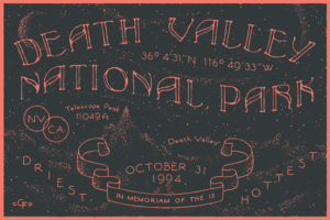
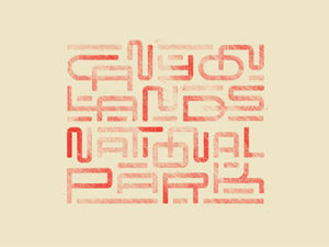
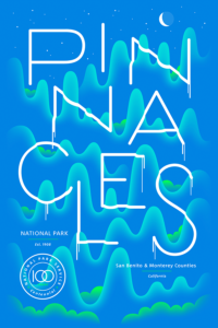
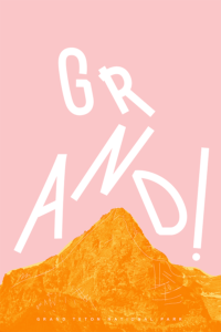
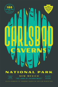
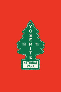
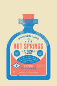
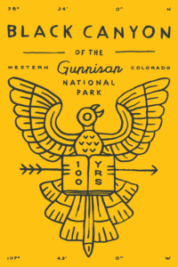
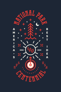
The United States has 59 protected areas known as national parks- over 84 million of the most awe-inspiring acres one would ever hope to see. In August of 2016, the nation began a yearlong celebration, the National Parks Centennial, honoring the 100 year anniversary since Woodrow Wilson signed an act creating the National Parks Service in 1916. The Centennial is a significant milestone, not just for the parks themselves, but for the 400,000+ employees and enthusiastic volunteers that make these glorious parks available for all to enjoy. I can only imagine that they head to work each and every day feeling like they are a part of something grand, meaningful and quite memorable.
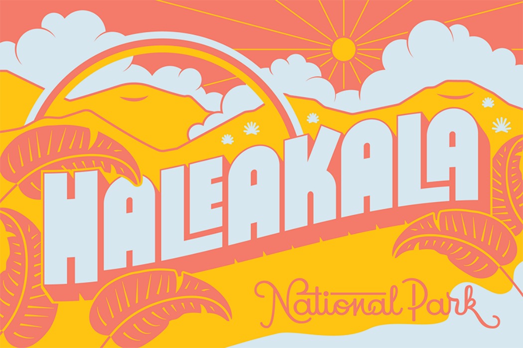
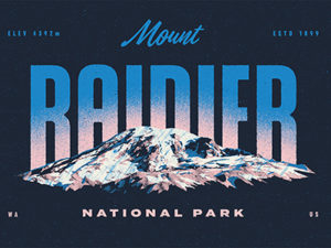
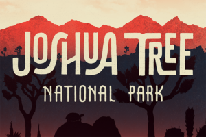
It’s the memories and shared experiences that inspired graphic designers David Rygiol and James Louis Walker to launch Type Hike, a collaborative, non-profit design project created to celebrate the outdoors though typography. Type Hike’s first project brings together a wildly diverse group of graphic artists to design posters for each national park in celebration of the Centennial, with 100% of the proceeds benefitting the National Park Foundation (that means you should buy at least a pair of prints, perhaps more). The art is striking, well-crafted and entirely unique to each park. In fact, participating artists had an opportunity to choose the park that resonated personally, and it shows. Inarguably, art connects us together in profound ways.
To give us all more insight into this extraordinary project, Type Hike’s founders David Rygiol and James Louis Walker give us a look inside their process…
How did the idea for Type Hike start – was the project inspired by the Park’s centennial?
James Walker (JW): After working on a few small things together, we wanted to launch a larger project aimed at unifying creatives around a common good. A few ideas were tossed around, but when David suggested the National Parks Centennial, we went for it. We both strongly agree that designers have an obligation to utilize their skills to beautify the world around them, and the National Parks Centennial presented that opportunity.
What was the process for connecting with the diverse array of designers involved in the project?
JW: Over the past few years, I have been emailing designers just to tell them how much I enjoy their work. This comfort in cold-contact made it quite easy to reach out to various creatives, asking for their help. We became aware of many of these designs through social media platforms, such as Dribbble and Instagram, while a few were personal contacts or friends-of-friends.
David and I have different tastes, which resulted in a nice mix of designers. The enthusiasm around the project gave us some confidence, and that’s when we started reaching out to some bigger names (e.g. David Carson, Jessica Hische).
Can you give us some insight into the creative process – did you issue overall creative direction or allow each designer full creative license?
JW: The only creative direction we issued was that of a fixed color palette, size, and the requirement that type be the main focus. There was some language within the invitation that stressed a desire to design something as a personal reflection on the park itself, leading us away from an expected aesthetic associated with the outdoors.
The submissions reflect that demand really well, and showcase the diversity in talent present in the project.
Here at Brandettes, we talk a lot about the development process. Often, a project evolves through that process into something even more profound than originally intended. I’m curious to hear if Type Hike evolved as you moved through the project?
JW: Yes, absolutely. The entire project was conceived, branded, and made live within two weeks time. We thought it would be a fun little project. When some bigger names in graphic design agreed to be part of it, some pressure built not only on us, but on other designers. To share a project with someone like David Carson or Jessica Hische forces you to work a little bit harder.
When the designs started coming in, we were so impressed. Exhibitions became necessary, as it would be a waste to not showcase this work in it’s originally intended form: posters.
Most of our evolution came from customer service. It’s just the two of us, yet we are fulfilling hundreds of orders, fielding questions, running social media, and working with printers. Now that we have momentum, the second series becomes a priority and there is a whole new stage of evolution to maintain that excitement, find new talent, and celebrate the parks.
I know I can’t possibly ask you to name your favorite poster. Do you each have a favorite park you enjoy visiting?
JW: Now that I’m a Texan, I am partial to Big Bend. Beyond it’s beauty, there’s something about getting there. So much wide open space in the drive, plus the overlooks towards Mexico. It puts you in a different time.
David Rygiol: My favorite park is always the next one I’m planning to visit, because there are few feelings more potent than the thrill of exploring a new landscape. The park that I treasure most is easily Yosemite – it’s full of memories: scout campouts, family vacations, drives through the high country, hiking Half Dome with my wife, my daughter cackling in the spray at Yosemite Falls – there’s no place like it.
What’s next for Type Hike in 2017 and beyond?
JW: We just launched our second series on January 1st, 2017 titled SHORES, focused on National Shorelines and Recreational Areas. There is currently an open call for submissions and we will choose the final 15 contributors in February. David and I have plans for future series, so keep an eye out!
In 2017, the Type Hike project will be exhibited at Wichita State University, Mississippi State University, and a gallery in Charleston, SC. There are a few more locations also in the works.
Visit Type Hike’s online gallery to view the 59 unique posters celebrating the National Parks Centennial, and to shop prints & postcards. Have a favorite? Drop us a line in the comments below.
Images courtesy of Type Hike
